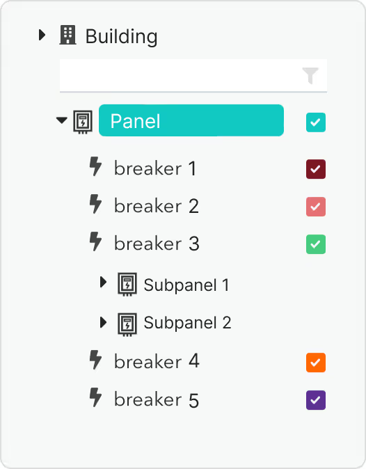
Managing your facility’s energy data just got easier with our latest update to the Verdigris Analytics Dashboard. We’re excited to introduce the new Hierarchical Power Distribution View, designed to help you better contextualize your facility’s data and streamline your energy management process.
Visualize Your Facility’s Power Distribution
The new hierarchy view allows you to see the relationships between your building, panels, and breakers in a clear, tree-format structure. This visualization provides a comprehensive overview of your power distribution, making it easier to track and manage energy use across your facility.

Getting Started: Setting up the hierarchy is straightforward. Simply email your Verdigris Customer Success Manager with up-to-date electrical line drawings or a breakdown from your facilities team. This is a one-time setup that will greatly enhance your ability to monitor and optimize your energy usage.
Additional Dashboard Enhancements
Alongside the hierarchy view, we’ve made several other improvements to the Analytics Dashboard:
- Collapsible Navigation Menu: Keep your focus on data trends and filters by collapsing the navigation menu when it’s not in use.
- Checkbox Selection of Assets: Easily toggle between Total and Individual views with a new checkbox selection feature.
- Bug Fixes: We’ve resolved issues to improve date filter navigation, ensure reliable downloads of .png and .csv data files, and correctly display metadata on Total Harmonic Distortion charts.
These updates are part of our ongoing commitment to providing you with the tools needed to optimize your energy management. Explore the new features today and reach out to your Customer Success Manager if you need any assistance.


